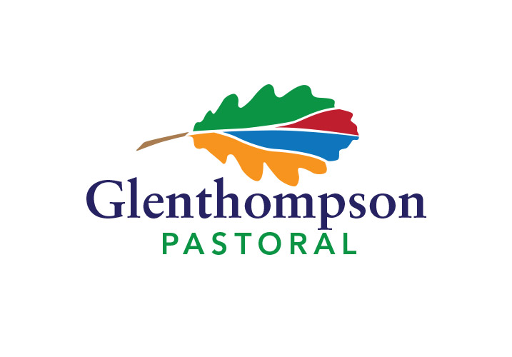
Glenthompson Pastoral logo
Graphic Design
Sector
Designing the Glenthompson Pastoral logo was a challenge. The family business is spread across several properties in south-western Victoria and run a range of different agricultural products. From sheep and lambs, to pigs and cattle, broad acre cropping, horses and a mix of tourism.
They have also had a long held belief in sustainable farming practices. The primary property base near the Grampians was inspiration for the image and icon in the logo.
Glenthompson also have a diverse portfolio with an investment and passion for oak trees forming the shape of the icon. The colours represent the diverse portfolio with a mix of contemporary and traditional fonts that can be applied across the different properties and interests.

