Our Projects
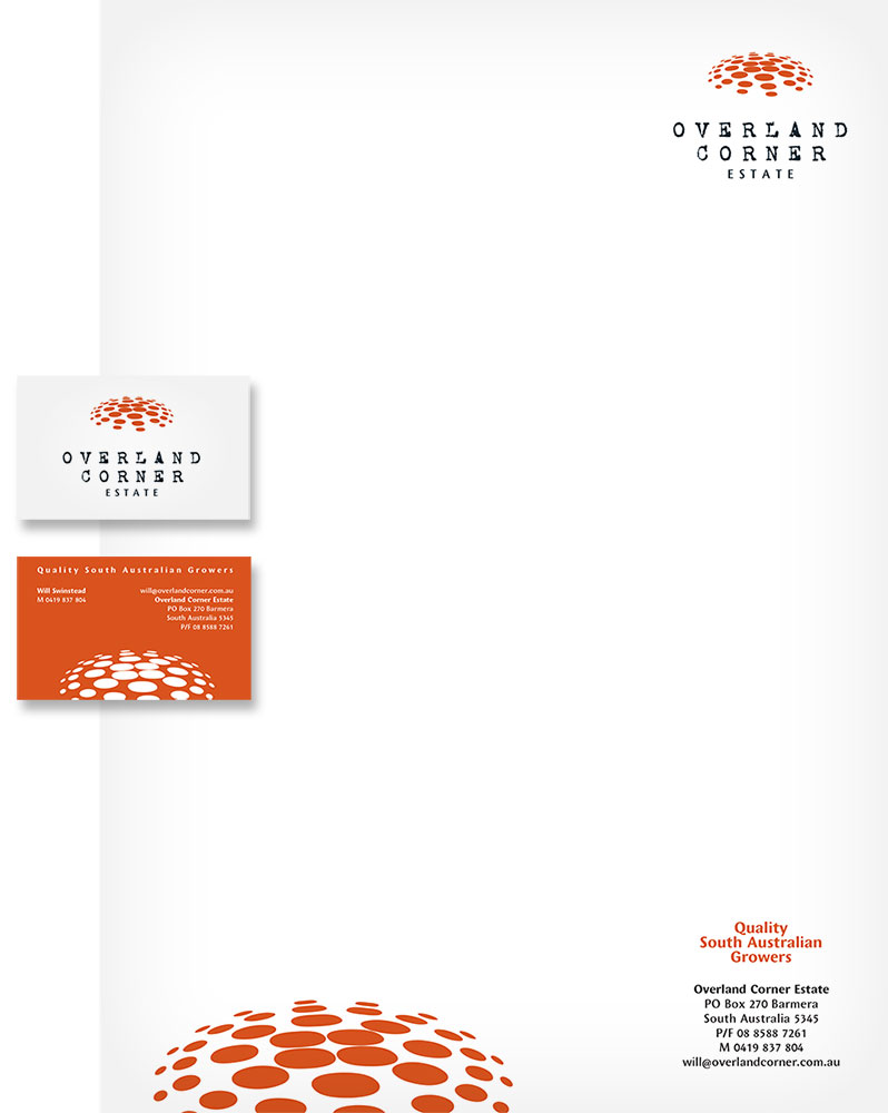
Designing the Overland Corner Estate stationery was based on the simplicity of the logo.
The environment of the estate is strong and bold. Application of the business card was the positive for the logo and then the reverse showing the bold colour for the back with the details.
Similarly the letterhead was a simple 2 colour design with the strong use of the graphic at the bottom of the page to tie the elements together.


